
Free preview · Chapter 1 of 8
Chapter 1 Layout and Conversion Structure
This is the full text of chapter 1 of the iGaming Media Buying Playbook, unabridged. The remaining seven chapters are the hands-on part: editing the template, deploying, cloaking, tracking, CAPI, LINE attribution, and creative approval.
This chapter is about what to build and why. Actually editing files happens in Chapter 2.
What you will learn
- How to use one decision table to settle, in 10 minutes, whether your landing page should be a credit model or a cash model, and where the primary CTA should point
- The measured click-conversion ranking of 20 real landing pages, plus the 6 design conclusions derived from that data. Two of them are counter-intuitive
- A copy-and-use fixed section skeleton (9 sections, fixed order), and which job in the funnel each section does
- Concrete parameters for 7 psychological trigger components (value ranges, intervals, timing), not filler like "consider adding social proof"
- Which common design choices actually dilute conversion intent (dual CTAs, raising the bonus, countdown timers)
- How to pick brand colours so the operator does not reject them, using a process you can verify
Prerequisites
| Item | Notes | If you do not have it |
|---|---|---|
| The URL of the platform you are promoting | The real site's home page, loading properly | Without the real site you cannot pull colours or match the game content. Ask the operator first |
| The operator's bonus terms | How much, how it is given, whether there is a threshold | Get this clear first. It decides the layout choice |
| The destination of the primary CTA | A messaging-app official account link, or the platform's registration URL | Missing this will block you in Chapter 2 |
| A computer + browser | For crawling the real site to pull colours | — |
Not needed: design software, coding ability, any paid tool. This chapter is all decisions, no code.
Time required
| Task | Time |
|---|---|
| Reading this chapter | 40–60 min |
| Running the decision table + crawling the site for colours | 30 min |
| Writing the conclusions into a "layout decision sheet" for Chapter 2 | 15 min |
First time through, budget 2 hours. Once you have done it once, a new brand of the same type takes 30 minutes to decide.
Chapter contents
| § | Content | Jump straight here if |
|---|---|---|
| 1 | Credit model vs cash model decision table | You have not picked a layout |
| 2 | Measured ranking of 20 real landing pages + layout index | You want the data, or a template to start from |
| 3 | Six design conclusions derived from the data | You already have a page and want to know what to change |
| 4 | The fixed 9-section skeleton + what goes in each | You are laying out a page from scratch |
| 5 | Concrete parameters for seven psychological triggers | You are adding social proof, live user counts or a sticky CTA |
| 6 | How to write the Hero | You only want to optimise the first screen |
| 7 | How to pull the colour scheme (site-crawling process) | The operator keeps rejecting your colours |
| 8 | Share preview image ratio | Your link previews get cropped |
| 9 | Why performance affects conversion | You want to know whether to bother with Chapter 2's optimisation |
| 10–11 | Pre-build checklist + common mistakes | Final self-check |
Terms, defined once
Every term appearing for the first time is explained here, and not again later.
| Term | Meaning |
|---|---|
| LP (landing page) | The first page someone sees after clicking the ad. |
| CTA | Call To Action. The button you want people to press. |
| Primary CTA | The one button on the page you most want pressed. A page should have exactly one primary CTA. |
| Hero | The top screen, visible without scrolling. |
| Below the fold | Everything you have to scroll to see. |
| CVR | Conversion rate. In this chapter, CVR = primary CTA events ÷ sessions. |
| Sessions | One continuous visit by one visitor counts as one. |
| Sticky | A component pinned to a position on screen that does not scroll away. |
| Credit model | You get credit just for opening an account: play first, settle later, no money up front. Traffic goes to a messaging app where sales staff work the lead. |
| Cash model | There is a genuine registration and deposit flow, headlined by a first-deposit bonus. |
| Landing rate | What share of the ad's "link clicks" actually finish loading the page. Chapter 2 uses this. |
1. The first decision: credit model or cash model
This decision drives 80% of the layout detail that follows. Do not skip it.
1.1 The decision table
Answer row by row. Whichever column has more ✅ is your answer.
| Question | Credit model | Cash model |
|---|---|---|
| Does the platform have its own online registration and payment flow? | No ✅ | Yes ✅ |
| Does the operator rely on sales staff working leads one-to-one in a messaging app? | Yes ✅ | No ✅ |
| Is the bonus "credit for opening an account" or "bonus on deposit"? | Credit ✅ | Deposit bonus ✅ |
| Are there tiered bonuses (first deposit, second deposit, daily rebate)? | No ✅ | Yes ✅ |
| Do you need to collect user details on the page? | No ✅ | Possibly ✅ |
1.2 The two layouts side by side
| Aspect | Credit model | Cash model |
|---|---|---|
| Primary CTA target | Messaging-app official account (the only exit) | Platform registration page, or a messaging app |
| Hero headline | "Open an account, get N · play first, settle later" | "Deposit X get Y" or "Register and get Z" |
| Mid-page section | Four-step account-opening diagram | 3–8 bonus cards |
| Game showcase | Can be dropped, or shrunk to a single row | A 6-card game wall is recommended |
| Where conversion happens | Off the page (in the messaging-app conversation) | On the page or on the registration page |
| What you can see in the data | Only "the CTA was pressed" | CTA pressed + registration completed |
⚠️ The credit model's data blind spot: the actual close happens inside a messaging-app conversation, where web analytics tools cannot see it. So the "conversions" in your reports are click intent, nothing more. To judge performance you have to reconcile with the operator on the real number of accounts opened. Chapter 5 (optimisation events) picks this up again.
1.3 What this decision produces
Write a "layout decision sheet". It is three lines. Chapter 2 uses it directly:
Layout: credit model / cash model
Primary CTA destination: <full URL>
Hero headline number: <e.g. "Open an account, get 35,000">
How you know it worked: all three lines are filled in, and "Primary CTA destination" is a complete URL you can paste into a browser and open (not "I'll ask the operator later"). If any line cannot be filled, go and ask. Do not carry on.
2. Measured ranking of 20 real landing pages
This is the core asset of the chapter, and one of the main reasons to buy this pack: these numbers are not guesses. They were measured under one analytics setup across 20 landing pages that were genuinely spending money on ads.
2.1 First, how to read this data
📅 Freshness notice: the data below is measured over the trailing 28 days as of early July 2026. Traffic source, audience and season all move the absolute numbers. Use it as a relative ordering, not as a target for your own page. Policy and markets shift; the method behind the conclusions outlasts the numbers.
Three limits you have to understand first:
- CVR here measures click intent, not deposits. The event is "pressed the primary CTA", not "this person paid".
- The credit model's real conversion happens off the page, so credit-model pages are structurally penalised in this table and cannot be compared like-for-like against cash-model pages.
- Pages with fewer than 50 sessions are excluded. Paused, just-launched and ended engagements are all out. One more page was excluded because a tracking misconfiguration (it fired only the CTA event, never a page view event) produced a fake 100% figure. That is a lesson in itself, and Chapter 4 covers how to avoid it.
2.2 The ranking
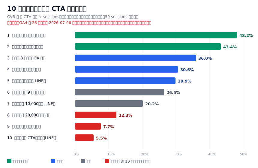
| Rank | Layout profile | Type | Primary CTA | Sessions | CVR |
|---|---|---|---|---|---|
| 1 | Referral-commission (free content + cash for bringing friends) | Free framing | App download | 2,971 | 48.2% |
| 2 | Free game wall (waterfall game cards + floating toasts) | Free framing | Direct registration | 424 | 43.4% |
| 3 | Cash model, 8 bonus cards + multi-account messaging-app split | Cash model | Messaging app | 261 | 36.0% |
| 4 | Cash model, bright antique-gold serif styling | Cash model | Direct registration | 545 | 30.6% |
| 5 | Cash model, mascot (a character expression on every card) | Cash model | Messaging app | 673 | 29.9% |
| 6 | Cash model, dark gold 9-cell dense bonus grid | Cash model | Direct registration | 584 | 26.5% |
| 7 | Credit model, 10,000 giveaway (standard layout) | Credit model | Messaging app | 688 | 20.2% |
| 8 | Credit model, 20,000 giveaway (almost the same template as rank 7) | Credit model | Messaging app | 790 | 12.3% |
| 9 | Cash model, the only one with a countdown timer | Cash model | Direct redirect | 65 | 7.7% |
| 10 | Cash model, dual CTA (registration + messaging app side by side) | Cash model | Two buttons | 2,900 | 5.5% |
2.2.1 Why the other 10 are not ranked (accounting for all 20)
The ranking table has only 10 rows, because the other 10 did not have enough sample to conclude anything during the measurement window. Here they all are, so you can judge for yourself:
| Page | Sessions | Reason for exclusion |
|---|---|---|
| Credit model, deep green emerald gold | 6 | Ads paused |
| Credit model, magazine-style asymmetric grid | 0 | Never went live |
| Cash model, brown-gold art deco | 0 | Engagement ended |
| Cash model, deep blue withdrawal guarantee | 0 | Engagement ended |
| Spanish-language market build | 0 | Payment provider cut off, whole project stalled |
| Credit model, A/B split build | 4 | Sample too small |
| Cash model, warm orange-red-gold sports build | 28 | Sample too small |
| Orange-red, dog mascot build | 12 | Sample too small |
| English financial-signals build | 6 | Sample too small |
| Purple-gold, floating egg-shape build | 162 | Tracking misconfigured (fired only the CTA event, never a page view event), producing a fake 100% figure |
💡 That last row is a lesson by itself: firing only the conversion event and never a page view event gives you a fake 100% conversion rate. When you see an implausibly high conversion rate, the first thing to check is whether the page view event is firing at all. Chapter 4 deals with this.
2.3 Full layout index (all 20, so you can pick the closest one)
Below is the layout classification of those 20 pages. Pick the one closest to what you need and start there. Do not design from scratch.
Credit model (5)
- Traditional centred layout with divider rules, deep green and emerald gold
- Magazine-style asymmetric grid (tilted cards + a ticker + oversized background numerals), wine red and gold. The most visually finished one in the library
- Standard layout with a skeleton CTA pulse animation, gold and orange on white
- A dark red near-copy of the previous one (same template, only the colours and amount changed)
- A/B split build: half the visitors are redirected straight to the messaging app, half see the full page
Cash model (8)
- 8 stacked bonus cards (the highest FOMO density in the library) + random split across three messaging-app accounts
- Warm orange-red-gold with a sports-event theme, a performance build that switched to system fonts
- Deep navy with a shark mascot (every bonus card and game card carries a character expression)
- Brown-gold art deco, React master template, exits straight to registration
- Deep blue, headlined on "guaranteed withdrawal speed", sharing tracking configuration with the previous one
- Antique-gold serif "treasure island" theme, top-up bonuses + a physical-gift store
- Dark gold 9-cell dense bonus grid
- Compliance-worded build routing to a messaging app, with a safe page (covered in Chapter 3)
Other markets / verticals (7)
- Orange-red with a dog mascot, signal sharing across two tracking codes
- Purple-gold with floating egg-shaped numerals + glitter effects, static single page
- Lucky-cat themed game wall waterfall + floating toasts + a VIP progress gauge
- Crypto theme, the only one with a countdown timer, redirects straight off-site
- Live-streaming theme + referral commission, driving app downloads
- Spanish-language market build, including local convenience-store payment methods
- English financial-signals build, including structured data markup
How you know it worked: you can point at one of the 20 above as closest to what you need, and say "I am keeping these three things from it and changing these two." If you cannot say that, you have not picked yet.
3. Six design conclusions derived from the data
This section is the most valuable part of the chapter. Each conclusion comes with "how to apply it to your own page".
⚠️ What these six are, stated up front: they are cross-page observations, not controlled experiments. Different pages inherently have different brands, audiences, traffic sources and flight periods. Those confounders are the same ones behind Conclusion 3, where I tell you not to compare "last month vs this month". So: treat them as direction, not verdict. Every one is labelled with its sample size, and you should discount the small ones yourself (Conclusion 6 has only 65 sessions). If you want to verify one properly, run two versions against the same audience at the same time. That is a control.
Conclusion 1: "free / referral" framing beats "top up first" framing by a mile
Ranks 1 and 2 (48.2%, 43.4%) are both no-commitment framings: "watch free", "play free", "bring a friend, get cash". Framings that require opening an account or topping up first peak at 36%.
How to apply it:
- If the operator's bonus can be packaged as "free first / claim first", package it that way. "Deposit 1000 get 1000" can be rewritten as a hero line of "Claim your 168 entry credit", with the deposit bonus pushed down into the bonus-card area.
- The first line of the Hero sets the framing. "Double your first deposit" is commitment framing; "Claim your 168" is free framing. The same bonus can be told either way.
- ⚠️ Note: this conclusion is about click rate. The people that free framing brings in may be lower quality. What matters is final cost, not click rate. Chapter 5 handles that.
Conclusion 2: stacked bonus cards + a mascot beat the plain standard layout
Rank 3 (8 bonus cards) at 36.0% and rank 5 (mascot) at 29.9% pull well clear of the plain standard credit-model pages (20.2%, 12.3%).
How to apply it:
- Go from 3 bonus cards to 6–8. Even if the content is one bonus broken into parts (first deposit, second deposit, daily rebate, birthday gift, referral gift…), the stacking itself works.
- You do not need to commission a mascot. The same character with a different expression or pose on each card is enough. What matters is that it keeps reappearing.
- The mascot comes back in Chapter 7: it is also a lever for passing review.
Conclusion 3 (counter-intuitive): raising the giveaway amount does not rescue conversion
This is the most important conclusion in the chapter. Ranks 7 and 8 are almost the same template, differing only in colours and amount:
| Rank 7 | Rank 8 | |
|---|---|---|
| Amount given | 10,000 | 20,000 (double) |
| CVR | 20.2% | 12.3% |
Give more, convert less.
How to apply it:
- When performance drops, do not reach for "raise the bonus" first. It probably will not help, and it eats margin directly.
- The real variables are traffic quality and audience, not the number in the offer. When performance dips, go look at the audience and the creative (Chapter 7), not the amount.
- If the operator insists on raising it, get them to run an A/B first: two amounts against the same audience at the same time, not "we gave 10k last month and 20k this month" (too much else changed in between).
Conclusion 4: dual CTAs dilute intent
The rank 10 page had the most traffic (2,900 sessions) and the best engagement (2.4 page views on average), but its primary CTA click rate was only 5.5%. It is the only page that put "register" and "add us on the messaging app" side by side as two buttons.
Give a visitor two paths and both paths lose clicks.
How to apply it:
- One page, one primary CTA. That is a hard rule.
- When you genuinely need two exits, make one clearly subordinate: the primary CTA is a full-width solid button, the secondary exit is a text link in the footer or inside the FAQ. Do not line up two buttons of the same size.
- The sticky bottom bar also gets one button only.
Conclusion 5: bright colour schemes edge out dark ones (this holds on landing pages too)
Rank 4's bright antique gold (30.6%) beat rank 6's dark gold (26.5%). This lines up with the creative-review conclusions in Chapter 7: a dark casino tone carries higher review risk and does not convert any better.
How to apply it:
- Default to a bright scheme. Use dark only when the operator explicitly asks for it.
- ⚠️ "The operator says they want a premium feel" does not mean "make it dark". When an operator says "platinum and classy", they mean bright, pale luxury (white / off-white + platinum silver + champagne gold), not dark and edgy. Take the adjectives literally: platinum / champagne = bright; black gold / midnight = dark. This has been misread more than once.
Conclusion 6: countdown timers are not a cure-all
The only page with a countdown timer converted at 7.7% (sample 65, small, treat as indicative).
How to apply it:
- Scarcity only works with the right offer behind it. A countdown alone will not rescue an unconvincing bonus.
- If you want one, pair it with a verifiable quantity limit such as "N places a day". That is more persuasive than a pure time countdown.
- Priority is low. Do the first five conclusions before you consider this.
4. The fixed skeleton: 9 sections, copy the order
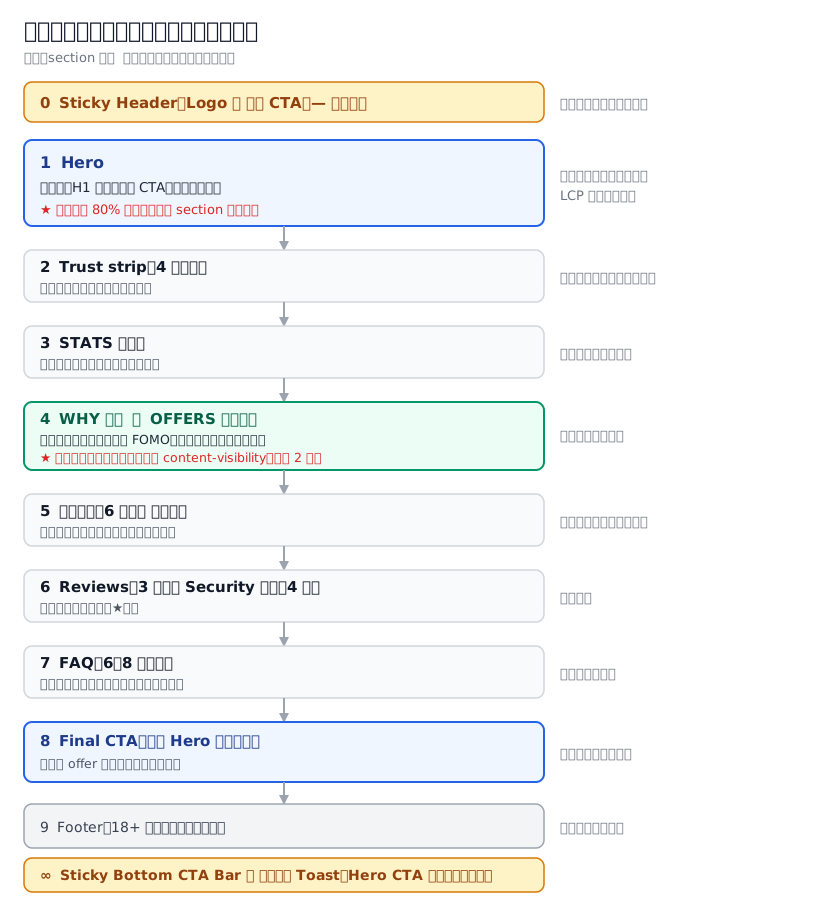
All 20 pages look like this. The order came out of live work, so do not rearrange it yourself. The image on the next page is the visual version of the same skeleton; read the two together.
4.1 What goes in each section
| # | Section | Must contain | Suggested height (mobile) |
|---|---|---|---|
| 0 | Sticky Header | Logo (left) + mini CTA button (right) | Fixed 56–64px |
| 1 | Hero | Key visual / H1 headline number / primary CTA / live user count / 3 trust badges | Within one screen (about 640px) |
| 2 | Trust strip | 4 icon cells: encryption / payout speed / support / fairness | 100–140px |
| 3 | STATS wall | 3–4 numbers: members / today's payouts / average payout minutes | 160–200px |
| 4 | WHY or OFFERS | Cash model: 3–8 bonus cards. Credit model: "four steps to open an account" | Depends on card count |
| 5 | Game showcase | 6 game cards (cash model). Credit model can drop it | Depends on card count |
| 6 | Reviews + Security | 3 user testimonials (with avatar / nickname / city / ★) + 4 security badges | 400–500px |
| 7 | FAQ | 6–8 collapsible questions | Depends on question count |
| 8 | Final CTA | Repeat the Hero's exact headline number, same button | 240–300px |
| 9 | Footer | 18+ warning, responsible gaming statement, copyright | 120–160px |
| ∞ | Sticky Bottom CTA | One full-width button, appearing only after the Hero CTA scrolls out of view | 64–72px |
4.2 Three principles about the order
- The Hero decides 80% of the result. The marginal contribution of the other 8 sections combined is smaller than switching the Hero headline from commitment framing to free framing. Split your optimisation time in the same proportion.
- Do not reword the Final CTA. People who scrolled to the bottom are high intent. They want to confirm the offer they just saw, not hear a new one. Use the same number and the same sentence.
- The footer warnings are not decoration. The 18+ and responsible gaming statements are seen by the review side and lower your risk score. Chapter 7 says more.
How you know it worked: sketch your page as the 10 rows above, and fill in specific content for every row. If any row says "figure it out later", do not build that section. A half-finished section hurts more than no section.
5. Seven psychological trigger components (with concrete parameters)
These are the components all 20 pages share. Copy the parameters directly, do not reinvent them.
5.1 Fake live user count
- Starting value: a number between 1,000 and 1,340
- Updates every 3,000–3,500 milliseconds
- Each change is −3 to +7 (slightly positive, so it looks like growth)
- Set a floor (say 800) so a visitor who lingers does not watch it fall to 0
- Put a small pulsing green dot next to it
Place it directly above the Hero's primary CTA. That is the strongest position for the nudge.
5.2 Floating social proof toast
- Content format:
fake name (Mr Wang)+city+verb (opened an account / claimed N / weekly payout)+"N minutes ago" - First appearance: 5 seconds after page load
- Loop interval: 14–20 seconds
- Display time per toast: 4.5 seconds
- Position: floating above the sticky bottom CTA bar, never covering the button
5.3 Sticky bottom CTA bar
- Do not show it from the start. Control it by watching whether the Hero's primary CTA is still on screen: show the bar only once the Hero CTA has scrolled out of view.
- The reason: showing it immediately overlaps the Hero CTA, which puts two identical buttons on the same screen and looks a mess.
- Technique (Chapter 2 gives the code): watch the Hero CTA element with
IntersectionObserver, not with a scroll event. Scroll events slow down the page's responsiveness.
5.4 Ticker (winner announcements)
- Content: exactly 8 fixed fake winning messages
- 🔴 Do not generate them randomly. A random value computed on the server does not match the one computed in the browser, and the display flickers (this is a hydration mismatch). Just hard-code 8 lines.
- Animation: infinite CSS scroll, about 26 seconds per loop
- To make it seamless: duplicate the 8 lines (
[...list, ...list]), so the halfway point looks continuous
5.5 CTA animation
- Pulse: one cycle every 2.4 seconds (shadow from light to deep)
- Shine sweep: every 3.4 seconds, an angled band of light crossing left to right
- 🔴 Animations may only move
transformandopacity. Running an infinite animation on properties likeleftorwidthforces the browser to recompute layout on every frame and piles up layout shift. Chapter 2 gives measured numbers and the fix.
5.6 Countdown timer (optional, lowest priority)
- Lock it to 23:59:59 local time tomorrow, stored in the browser's local storage
- On expiry, add 24 hours automatically (never let it show negative numbers)
- Always pair it with "N places a day". A bare countdown does little on its own (see Conclusion 6)
5.7 Large numerals with a gold gradient
- How: gradient background + clipped to the text (
background-clip: text) + transparent text fill - 🔴 The trap you will hit: text built this way lets a text shadow inherited from a parent element bleed through from behind the transparent glyphs, turning the whole numeral a muddy grey. Once that happens, no amount of tweaking the gradient colours will help.
- Fix: any element using this technique must explicitly set
text-shadow: none. Do not assume the parent has none. - If you want depth, use
filter: drop-shadow(...)instead. It acts on the composited pixels, so it does not bleed through. - How to recognise it: the gradient text looks dirty, grey, or as if the styles never applied, yet developer tools show the styles are in effect → go and check the inheritance chain for a text shadow, and stop adjusting colour values.
- Fix: any element using this technique must explicitly set
How you know it worked: for these 7 components, you can say which ones you are building and which you are not, and for each one you are building you can state the parameters (how many seconds, how many entries, what range). If you cannot state the parameters, you have not understood the section yet.
6. How to write the Hero (calibrated against general practice)
The Hero is the one section worth polishing repeatedly.
| Item | Spec | Why |
|---|---|---|
| H1 length | ≤ 8 Chinese characters (or 44 English characters) | Fits on one line on mobile |
| H1 content | Outcome first, with the number in it | "3,000 gets you 3,188" beats "the finest gaming platform" |
| Subhead | Three selling points on one line, separated by · | e.g. "100% first deposit · 5-minute payout · 666 for registering" |
| Primary CTA text | Start with a verb, never "Submit" or "Learn more" | "Join free and try it", "Open an account now" |
| Primary CTA size | Full width, height 56–60px | Tap targets on mobile need at least 44×44px |
| Trust badges | 3 small badges below the CTA | Removes the last hesitation before pressing |
| Key visual | Must be marked high priority, never lazy-loaded | It is the largest contentful paint element; lazy-loading it is suicide |
The Hero's stacking order (top to bottom)
Logo (small)
  ↓
One line of lead-in text ("100% first deposit match · featured now")
  ↓
H1 headline number
  ↓
Subhead, three selling points
  ↓
Live user count           ← the nudge
  ↓
Primary CTA (full-width large button)
  ↓
Three trust badges        ← removes hesitation
The logic of this order is: give the reason → then the nudge → then the button → then one last layer of reassurance. Putting the trust badges above the button weakens the nudge.
7. Colours: pull them from the real site, never from adjectives
7.1 Why this section exists
A trap I have actually walked into: the operator said "trendy tech vibe", so I built the page on gut feel with a dark purple-black background and neon purple-blue. It got rejected. Crawling the real site showed the brand colours were indigo + white background + fluorescent green, a clean fintech look, the exact opposite direction. The whole layout had to be rebuilt.
7.2 The colour-pulling process (follow it, 5 minutes)
Step 1: get the real site's stylesheet URL
Open the real site in a browser → press F12 for developer tools → switch to the Network tab → refresh → filter by CSS → the first large file you see is the main stylesheet. Right-click and copy its URL.
How you know it worked: you have a complete URL ending in .css that opens in a browser and shows a wall of style rules.
Step 2: find the :root variable block
On that CSS file's page, press Ctrl+F and search for :root. The braces you land on contain the brand's colour system.
How you know it worked: you can see a block of declarations along the lines of --color-primary: #6352ff;.
Step 3: count which hex codes appear most
Still on that page, press Ctrl+F and search for #, then see which six-digit hex codes repeat. The most frequent one is usually the brand's primary colour.
Step 4: 🔴 cross-check against the logo file
This step is the critical one. Do not skip it.
Plenty of sites use an off-the-shelf front-end framework, and their :root holds the framework's default colours, which have nothing to do with the brand. In one case the site's :root was entirely one framework's default greens, while the real brand colour (an orange-red gradient) existed only inside the logo file.
What to do: ask the operator for the vector version of the logo (.svg). Open it in a plain text editor and find stop-color inside the <linearGradient> block. That is the exact brand gradient.
How you know it worked: you have 2–4 hex codes that satisfy both conditions: they appear in the logo file, and they appear on the high-frequency list from the site's CSS. If both sides agree, those are the brand colours. If only one side has it, the logo wins.
7.3 The output
Write a colour swatch table with a source column:
| Use | Hex | Source |
|---|---|---|
| Primary | #______ | Logo gradient, first stop |
| Secondary | #______ | Logo gradient, second stop |
| Accent (CTA) | #______ | High-frequency colour in site CSS |
| Background | #______ | Site body |
What the source column is for: when the operator later questions the colours, you can point at "this came out of your own logo". That settles it far faster than arguing about taste.
8. The share preview (OG image) ratio
A small but common mistake: reusing the key visual banner as the share preview image.
- The standard share preview ratio is 1200×630 (about 1.91:1).
- Key visual banners are usually 1.5:1 or 4:3. Used directly, social platforms crop the top and bottom off, and the headline and mascot can disappear entirely.
- When the operator pastes the link into a messaging app and sees a mangled preview, they will assume you never changed the image at all.
What to do: make a separate 1200×630 image. Recompose it from the key visual, or generate a fresh one.
The 5 required tags (Chapter 2 tells you which file they go in):
<meta property="og:image" content="https://YOUR_DOMAIN/og-image.webp" />
<meta property="og:image:width" content="1200" />
<meta property="og:image:height" content="630" />
<meta property="og:image:type" content="image/webp" />
<meta property="og:image:alt" content="Description of the key visual (brand plus main claim)" />
Clearing the platform cache after swapping the image:
| Platform | How to force a refresh |
|---|---|
| Open the official sharing debugger, paste the URL, press "Scrape Again" 3 times | |
| LINE | Paste the link in a fresh chat window, or append ?v=2 to the URL |
| Telegram | Append ?v=2 and repost, or delete the message and send it again |
How you know it worked: paste your URL into Facebook's sharing debugger and the preview image is complete, with nothing cut off the subject.
9. Performance: this chapter only covers "why you should care"
Full measurement and fixes are in Chapter 2. Here you only get the basis for judging.
In one line: every extra second of load time costs you conversions. ("1 second ≈ 7%" is a rule of thumb that has circulated for years, sourced from early e-commerce research. It is not measured in this pack and may not hold in your market. Take it as direction only. The number you should actually watch is the one below, which you can measure yourself.)
A more concrete test (Chapter 2 teaches you how to pull the figure): in the ads back office, check what share of "link clicks" actually became "page views". That ratio is the landing rate.
- Landing rate below roughly 70% → your money is dying on load. Fix page speed first and leave the creative alone
- Landing rate normal but performance poor → this is a persuasion problem. Go back to Conclusions 1–6 in this chapter
One measured case: a landing rate of 55%, meaning 45% of the people who clicked the ad never waited for the page to appear. Of the people who did wait, half pressed the CTA. The page itself was strong; the money was purely dying on load.
So the design conclusions in this chapter only apply if the page actually loads. The performance section of Chapter 2 is not optional.
10. Final checklist before you build
Everything that must be decided before Chapter 2 starts. Tick all of it before moving on.
- Layout chosen: credit model / cash model
- Primary CTA destination URL is in hand and opens in a browser
- The page has exactly one primary CTA (Conclusion 4)
- The Hero headline uses "free / claim first" framing rather than "top up first" (Conclusion 1, where it can be packaged that way)
- H1 is within 8 Chinese characters and contains a number
- Bonus cards ≥ 3, ideally 6–8 (Conclusion 2)
- Colours verified from both the logo and the site CSS, not taken from adjectives
- Colour direction leans bright (Conclusion 5), unless the operator explicitly asks for dark
- Decided which psychological trigger components to build, with parameters written down for each
- A 1200×630 share preview image is ready
- The key visual is confirmed as high priority, never lazy-loaded
- "Raise the bonus" is not your first optimisation move (Conclusion 3)
11. The five things most often got wrong in this chapter
| # | Mistake | Consequence | The right move |
|---|---|---|---|
| 1 | Designing a layout from scratch | Three days spent producing a page that converts worse than a template | Pick the closest of the 20 in §2.3 and edit it |
| 2 | Two CTAs of equal size side by side | Both lose clicks (measured at 5.5%) | Make one clearly primary, demote the secondary exit to a text link |
| 3 | Raising the bonus when performance drops | Eats margin, conversion does not move or gets worse | Check traffic quality and creative first |
| 4 | Picking colours from the operator's adjectives | Rejected on delivery, rebuilt | Crawl the real site + read the logo vector file |
| 5 | Setting the key visual to lazy-load | Largest contentful paint blows out, landing rate collapses | Mark it high priority, never lazy |
What comes next
- Decisions done → Chapter 2: template changes and deployment (turning these decisions into a URL that is actually live)
- Before you run ads → Chapter 3: the three-layer cloak (skip it and the page will get you disapproved)
- How to install tracking → Chapter 4: the GTM tracking skeleton
- Why creatives get rejected → Chapter 7: passing creative review and account ban traps
End of Chapter 1. All figures in this chapter were measured in July–August 2026; policy and market conditions can change.